

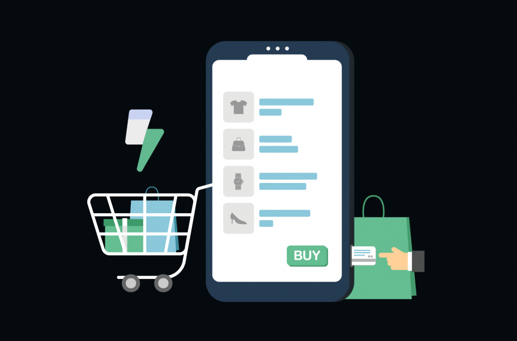
Mobile optimization is a powerful force driving the online retail world. As mobile devices continue to dominate how consumers interact with eCommerce businesses, it’s crucial to ensure that your WooCommerce store is tailored to provide a seamless experience for mobile users.
But why is mobile optimization so vital for your online store? The answer lies in its undeniable impact on conversion rates and user experience. By optimizing your WooCommerce store for mobile devices, you not only create an engaging and accessible environment for potential customers, but you also increase the likelihood that they’ll complete a purchase, ultimately driving your store’s growth and success.
So, let’s dive into the world of maximizing mobile conversions and explore how you can optimize your WooCommerce store to capture the attention and wallets of the mobile masses!
The Rise of Mobile Commerce and Why It Matters
Mobile commerce, or m-commerce, has experienced a meteoric rise in recent years as more and more consumers shift their shopping habits from desktops to the palm of their hands. This growth in mobile shopping has significant implications for eCommerce businesses, with mobile devices now accounting for a substantial percentage of online sales. However, mobile conversions are consistently lower than conversions via desktop and tablet.
This discrepancy between mobile traffic (which represents over half of the global web traffic) and mobile conversions highlights a window of opportunity for businesses to better cater to the needs and preferences of mobile users. Clearly, the demand for excellent mobile-based user experiences is there, but many eCommerce sites have a way to go in delivering on those expectations.
Responsive Web Design: The Key to a Mobile-Friendly WooCommerce Store

So, how can you make your WooCommerce store more accessible and appealing to mobile users? The answer lies in responsive web design. This design approach ensures that your website’s layout, images, and other elements automatically adjust to fit the screen of the device being used, providing an optimal viewing experience for all users.
A responsive WooCommerce store offers several benefits:
- Enhanced user experience: By ensuring that your store looks great and functions seamlessly on all devices, you create a positive experience for your customers, which can boost satisfaction and drive repeat purchases.
- Improved SEO: Search engines, like Google, favor responsive websites in their rankings. A mobile-friendly store can help you achieve better search engine visibility, attracting more potential customers to your site.
- Easier maintenance: With a responsive design, you only need to maintain one version of your site, making it easier to update content and fix issues across all devices.
- Increased conversion rates: A mobile-optimized store removes barriers for users, making it simpler for them to browse and complete purchases. This can lead to higher conversion rates and increased revenue for your business.
How to Choose a Mobile-Friendly WordPress Theme
Selecting a mobile-friendly WordPress theme is the first step toward creating a responsive WooCommerce store. When choosing a theme, consider the following factors:
- Responsiveness: Ensure that the theme you choose is explicitly designed to be responsive and mobile-friendly. Many theme developers highlight this feature in their descriptions, so look for themes that explicitly mention mobile optimization.
- Performance: A fast-loading theme is essential for mobile users, who may have limited bandwidth or slower internet connections. Opt for a lightweight theme that prioritizes performance without compromising on design.
- Compatibility: Confirm that the theme you select is compatible with WooCommerce, as well as any other plugins you plan to use on your site.
- Customization: Look for a theme that offers a wide range of customization options, allowing you to tailor your store’s appearance and functionality to meet the needs of your target audience.
- Competitor sites: If you’re still not sure what to look for in a theme, check out high-quality competitor websites to inspire you. Doing so will help you to identify the elements you want as well as what you don’t.
Tips for Testing Your WooCommerce Store’s Mobile Responsiveness
Once you’ve selected and implemented a mobile-friendly theme, testing your WooCommerce store’s mobile responsiveness is crucial to ensure it delivers an optimal user experience on various devices. Here are some tips for testing your store’s responsiveness:
- Use mobile device emulators: Many web browsers, like Google Chrome and Mozilla Firefox, offer built-in device emulation tools that allow you to preview your website on various screen sizes and resolutions. These tools can help you identify any layout or design issues that may arise on mobile devices.
- Test on actual devices: While emulators are helpful, nothing beats testing your store on real devices. Try accessing your website on multiple smartphones and tablets to see how it performs on different platforms and screen sizes.
- Check for touch-friendly elements: Ensure that all interactive elements, such as buttons and links, are large enough and spaced appropriately for easy use on touchscreens.
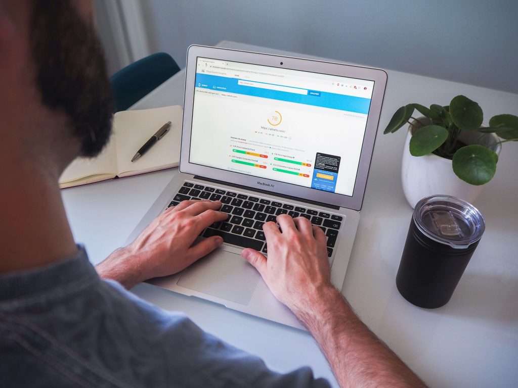
- Test page load speed: Use tools like Google PageSpeed Insights and GTmetrix to measure your site’s loading speed on mobile devices. Aim for a fast-loading website with a host like Bluehost that can improve user experience and reduce the likelihood of potential customers abandoning your site due to slow load times.
Streamlining the Mobile Checkout Process
A crucial aspect of optimizing your WooCommerce store for mobile users is ensuring a smooth and efficient checkout process.
A seamless checkout experience can significantly impact mobile conversions, as customers are more likely to abandon their carts if they encounter a complicated or time-consuming checkout process. By simplifying and improving the mobile checkout experience, you can increase the likelihood of customers completing their purchases and returning for future transactions.
Here are some strategies to help you streamline the mobile checkout process and boost conversion rates:
- Minimize the number of steps: Reduce the number of steps or screens customers must navigate during the checkout process. This can be achieved by consolidating billing and shipping information forms or by offering a guest checkout option that doesn’t require account creation. However, keep the steps that are most important to your business; for example, the inclusion of a tipping option at the checkout if you have a restaurant system set up in WooCommerce or similar.
- Optimize form fields: Ensure that your checkout forms are mobile-friendly and responsive forms by using large, easily-tappable input fields and providing clear labels. Utilize input types that trigger appropriate mobile keyboards, such as the number pad for phone numbers or the email keyboard for email addresses.
- Save customer information: Allow customers to save their personal and payment information for faster checkouts during future visits. This feature can be particularly beneficial for registered users, who will appreciate the convenience of not having to re-enter their information each time they shop.
- Offer clear error messages: Provide clear, concise error messages that guide customers in correcting any input errors during the checkout process. This can help prevent frustration and reduce the likelihood of cart abandonment.
- Progress indicators: Include progress indicators that show customers how many steps are left in the checkout process. This can help set expectations and reassure customers that the process is moving along efficiently.
Mobile-Friendly Product Pages and Navigation
An essential component of optimizing your WooCommerce store for mobile users is creating mobile-friendly product pages and navigation systems. By ensuring that your product pages are visually appealing and easy to navigate on mobile devices, you can enhance the shopping experience for your customers and increase the likelihood of conversions.
Tips for Creating Mobile-Optimized Product Pages
To create mobile-optimized product pages, consider the following tips:
- Clear descriptions: Provide concise yet informative product descriptions that clearly convey the features and benefits of your products. Use bullet points, headings, and short paragraphs to make your descriptions easily scannable on mobile devices.
- High-quality images: Use high-quality images that showcase your products from multiple angles. Opt for responsive images that automatically resize based on the user’s device to ensure optimal load times and user experience.
- Optimized image galleries: Implement touch-friendly image galleries that allow mobile users to swipe through product images or pinch to zoom in for more detail.
- Prominent call-to-action buttons: Use large, easily-tappable call-to-action buttons, such as “Add to Cart” or “Buy Now,” to encourage users to complete their purchases.
- No-code solutions: Using a no-code plugin for related products can help you quickly and easily create personalized product recommendations, improving the shopping experience for your mobile customers.
- Optimizing product customization: If you give customers the option to personalize products, you need to ensure your swatches, checkboxes, and other customization tools are touch-friendly so that the personalization process works seamlessly on any device.
Leveraging Mobile Marketing Strategies
Optimizing your WooCommerce store for mobile users is just one part of the equation when it comes to maximizing mobile conversions. To drive traffic and conversions, you’ll also need to implement effective mobile marketing strategies that capture the attention of potential customers and encourage them to visit and shop at your online store.
Mobile marketing is essential for eCommerce businesses, as it enables you to reach potential customers where they spend a significant amount of their time – on their smartphones and tablets. By creating targeted and engaging mobile ads and promotions, you can increase brand awareness, drive traffic to your WooCommerce store, and ultimately, boost your mobile conversion rates.
To create impactful mobile ads and promotions, consider the following tips:
- Targeted audience: Use audience targeting features on advertising platforms like Google Ads and Facebook Ads to ensure your ads are shown to users who are most likely to be interested in your products.
- Mobile-friendly design: Design your ads with mobile users in mind, using clear, easy-to-read text and eye-catching visuals that stand out on smaller screens.
- Clear call-to-action: Include a strong call-to-action that encourages users to visit your store or take advantage of a limited-time promotion.
- Track and optimize: Monitor the performance of your mobile ads and promotions, and adjust your targeting, messaging, or design as needed to improve their effectiveness.
In addition to mobile ads, integrating SMS (Short Message Service) and push notifications into your mobile marketing strategy can help increase engagement and drive conversions. Here’s how:
- SMS marketing: Send targeted promotional messages, exclusive discounts, or personalized product recommendations to customers who have opted in to receive promotional SMS updates from your store. Ensure that your messages are concise and relevant, and provide clear instructions on how customers can take advantage of the offer.
- Push notifications: Implement push notifications through a mobile app or web-based notifications to keep customers informed about new product launches, promotions, or order status updates. Customize your push notifications based on user behavior and preferences to provide a more personalized experience.
Monitoring and Analyzing Mobile Performance

Keeping a close eye on your mobile performance is crucial for ensuring the continued success of your WooCommerce store. By tracking mobile user behavior and conversions, you can gain valuable insights that help you identify areas for improvement and make data-driven decisions to optimize your store for mobile users.
There are various tools and analytics platforms available that can help you monitor your store’s mobile performance. Some recommended options include:
- Google Analytics: Google Analytics provides extensive data on user behavior, including mobile-specific insights. Utilize the built-in mobile reports to analyze mobile traffic, conversions, and user behavior.
- Hotjar: Hotjar offers heatmaps and user session recordings, allowing you to visualize how mobile users interact with your store. Identify potential pain points or areas for improvement based on user behavior patterns.
- WooCommerce-specific analytics plugins: Various plugins, such as Metorik, offer in-depth insights tailored specifically for WooCommerce stores.
After analyzing the data from your chosen analytics tools, use the insights to make informed decisions for further mobile optimization:
- Identify problem areas: Pinpoint areas where users may be experiencing difficulties or frustrations, such as high bounce rates on specific pages or low conversions on certain products.
- Test and iterate: Implement changes to address identified issues and continuously test their impact on mobile user behavior and conversion rates. This could include tweaking the design, navigation, or checkout process.
- Monitor trends: Keep an eye on emerging mobile usage trends and adapt your store accordingly to stay ahead of the competition and cater to evolving customer expectations.
Start Making Your WooCommerce Store More Mobile-Friendly Today
With the rise of mobile commerce and the ever-growing reliance on smartphones and tablets, it’s essential to provide a seamless shopping experience for your customers. By implementing responsive web design, streamlining the mobile checkout process, creating mobile-friendly product pages, and leveraging mobile marketing strategies, you can effectively maximize mobile conversions and drive growth for your online store.
Monitoring and analyzing mobile performance is an ongoing process that helps you stay ahead of the competition, ensuring your WooCommerce store remains a mobile-friendly haven for customers. Embrace the power of mobile optimization and watch your conversion rates soar as you capture the attention and wallets of mobile users worldwide!